
Possible Identities for a Gourmet Salsa
This project was a challenge to redesign a product I use in my daily life. I chose Mateo's gourmet salsa. I came up with 3 different concepts, which was meant to emulate the process of showing different iterations to a client and letting them pick which way to go.
There were no requirements, other than maintaining a design that could actually be used.
initial ideas


>back to roots
meant to feel mexican, for lack of a better word. im mexican so trust me. take inspiration from traditional aesthetics.
>from the farm
invoke the feeling of a smaller operation salsa you would get at a farmer's market. handwritten for authenthic feel.

>sauce sauce sauce
bring it back to the star of the show, the sauce itself. use fonts that feel... saucy.

idea 1: tradition
this iteration takes inspiration from traditional mexican aesthethics and weaving patterns to create an elegant version of the jar that reflects the roots of the recipes. a number system denotes heat level.
fonts used: arizonia regular, fleur de leah regular, akaya tellvigala regular
intended themes: elegance, traditional, gourmet


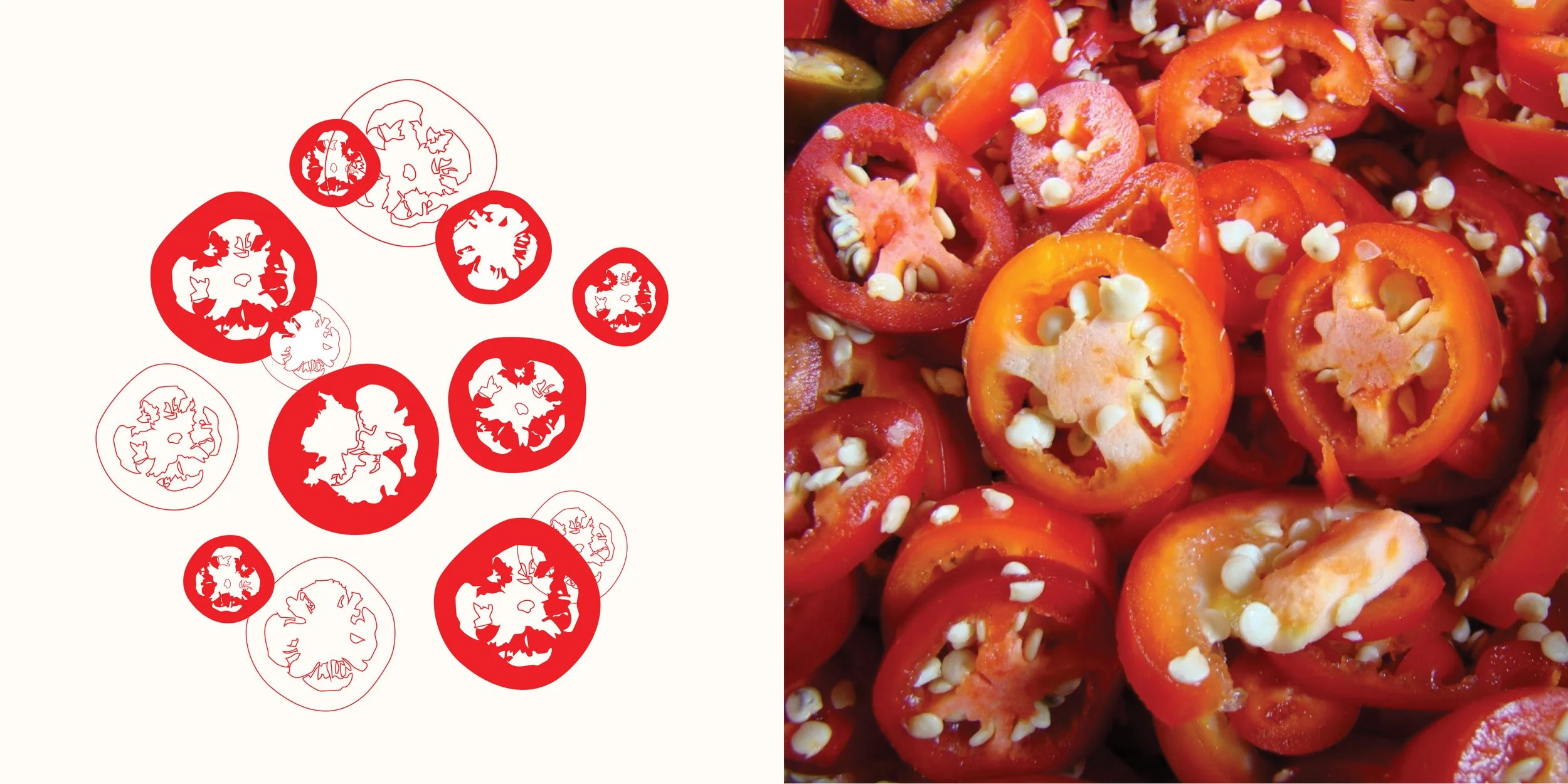
idea 2: gardener
this is supposed to feel closer to a handpacked jar. the key ingredients are highlighted on the design, and everything is focused on where this salsa goodness comes from- mother earth. the spiciness is indicated by a growing plant that reaches maturity at the hottest level.
fonts used: zeyada regular, allison regular, covered by your grace regular
intended themes: green thumb, quality ingredients, earthy
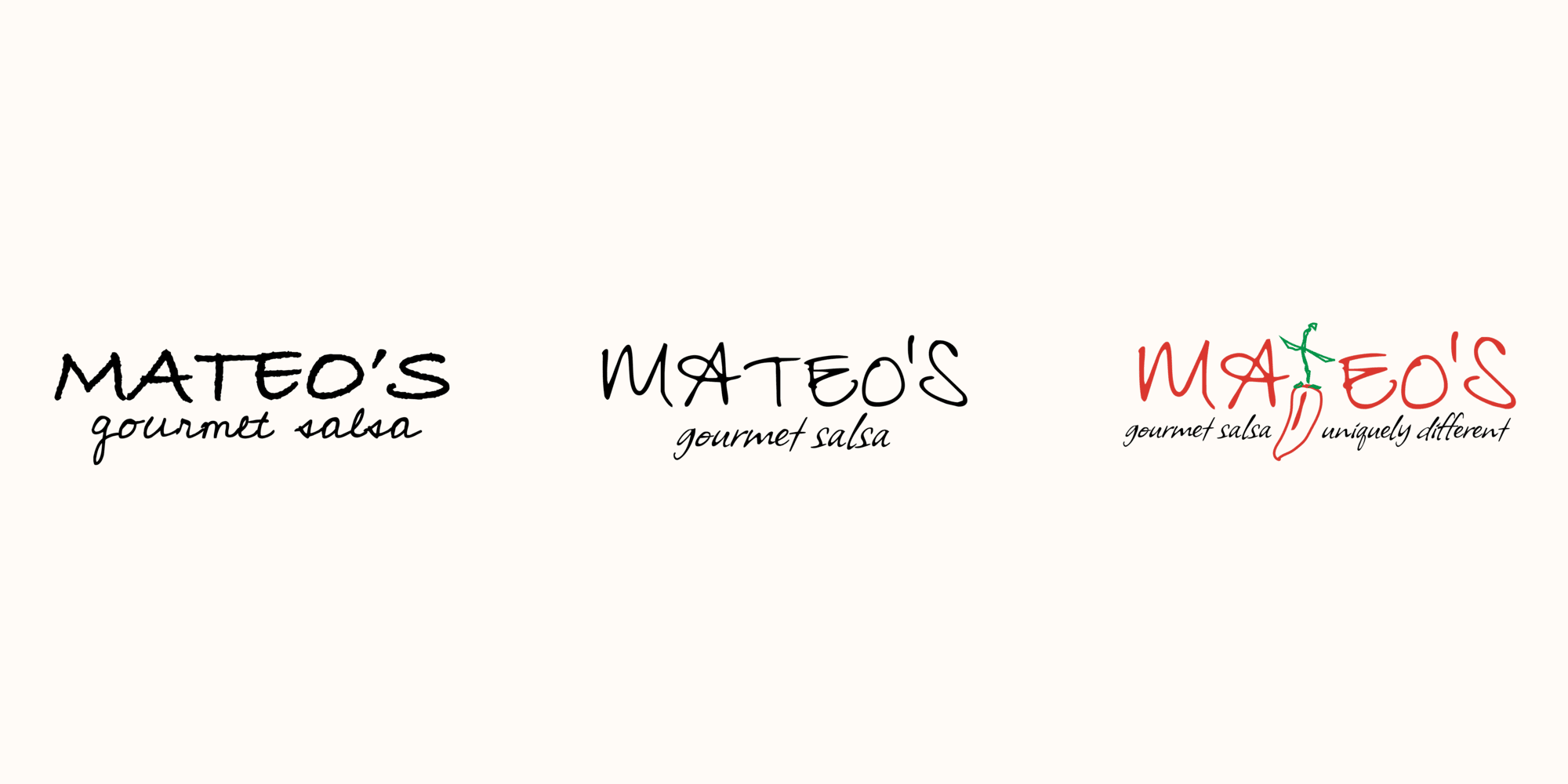


idea 3: chili p.
this colorful iteration is the closest to the color blocks of the original design. the original mascot, mr pepper, can be reused and turned into the heat indicator itself, making him the sole focus of the jar.
fonts used: flavors regular, akaya tellvigala regular
intended themes: colorful, easy to follow, eye catching


